DNRG - An Enterprise Website Refresh Project
As one of the largest electricity and natural gas vendors in Central Canada & Southern United States. DNRG is looking to upscale its content authoring capability by adopting Adobe Experience Manager (AEM)
Inside this project ↓
Disclaimer: DNRG is a hypothetical entity, utilized solely for illustrative purposes within this case study. However, The circumstances and events depicted herein closely resemble an actual project in which I was professionally involved. The “Deliverable” link provided below serves as a representative example and may not accurately reflect the specific subject matter discussed within this article.
Project Overview
Jason makes really good decisions technically. He’s leading the team on the frontend/ AEM Storybook side of our DNRG implementation. I’m really impressed by your ability to understand requirements and come up with multiple options to a solution, weigh up those options, and then decide on the best way forward.
Two Systems, One Experience
There are two types of experiences on the legacy DNRG website
📄 Marketing pages
Authored in home-grown CMS
- Content (copies, images) requires frequent update
- Content is mostly static, abeit a few personalized sections
- Large usage of decorative elements (e.g. animations, parallax, custom SVG backgrounds)
- Stateless UI components
- Little to no API calls to fetch data; Use assets from CMS directly
👤 Application pages
Developed with jQuery and PHP
- Content doesn't change often
- Content is highly tailored to current user
- Little to no decorative elements
- Complex UI state management
- Heavy usage of API calls to fetch data
We need to provide a seamless experience to transition between the two systems, while also maintaining a highly consistent look and feel. Due to the stark difference in tech stack between these two systems, we decided to use Storybook to create a shared design system, and distribute it among the two apps as an NPM package.
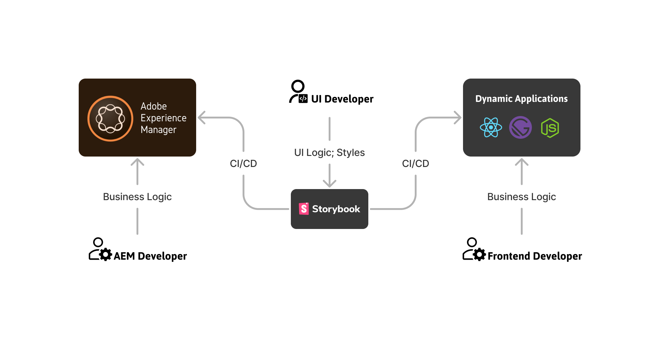 The final frontend architecture
DesignOps: Managing UI Changes at Scale
Several weeks into the UI Development phase, I started to noticed our process of managing UI changes was getting out of hand. Normally changes to UI is fully expected, since the UI Design and QA process is iterative. However, we observed the following issues:
- We already have a lot of UI components to manage, and the number was growing very fast (~15 new components per week).
- Request for changes were coming in from all directions: the client, the QA team, the backend team, and the design team, and in some cases the request are conflicting with each other.
- Reviewers are getting overwhelmed and confused, because they sometimes do not have a clear picture of what the requirements are.
- Add a lot of pressure to our release and deployment schedule. Sometimes we have to release twice or thrice a day, just to make sure the changes get to downstream on time.
I called a meeting with the team to discuss this issue, and we decided to implement a few adjustment to our UI Change process.
- Tickets requesting changes are grouped under a single Jira epic, and should be approved and groomed by design and frontend leads before pulling into backlog.
- We will adopt Chromatic as our UI review platform, where the design & marketing team will visually audit the changes.
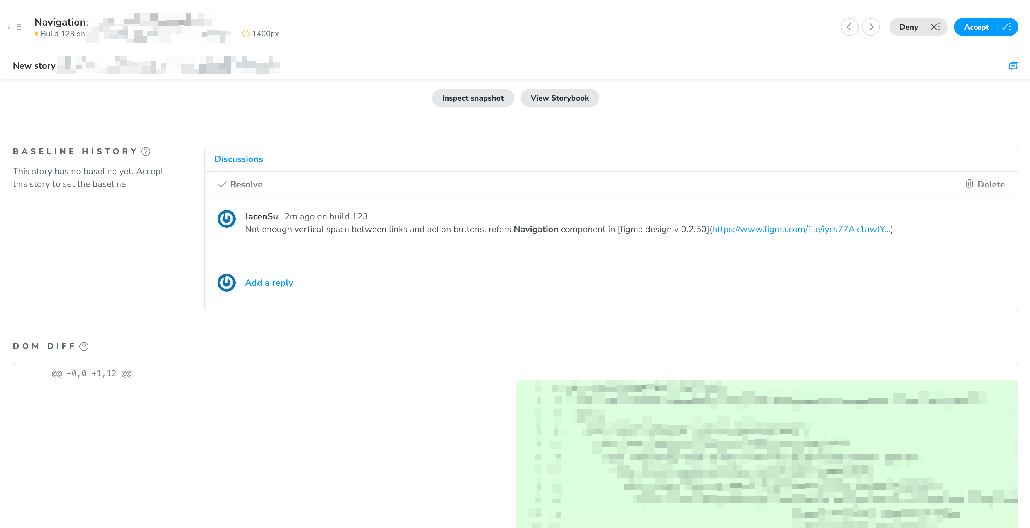 Approver provided feedback on changes
- We will deploy the changes weekly to Chromatic, and only the approved changes will be merged to the main branch.
- We also created a custom tag in our git commit message to track the changes, and make it easier to roll-back if needed.
- We encourage individual designers, QA testers, and developers to form smaller groups to circulate feedbacks and showcase fixes.
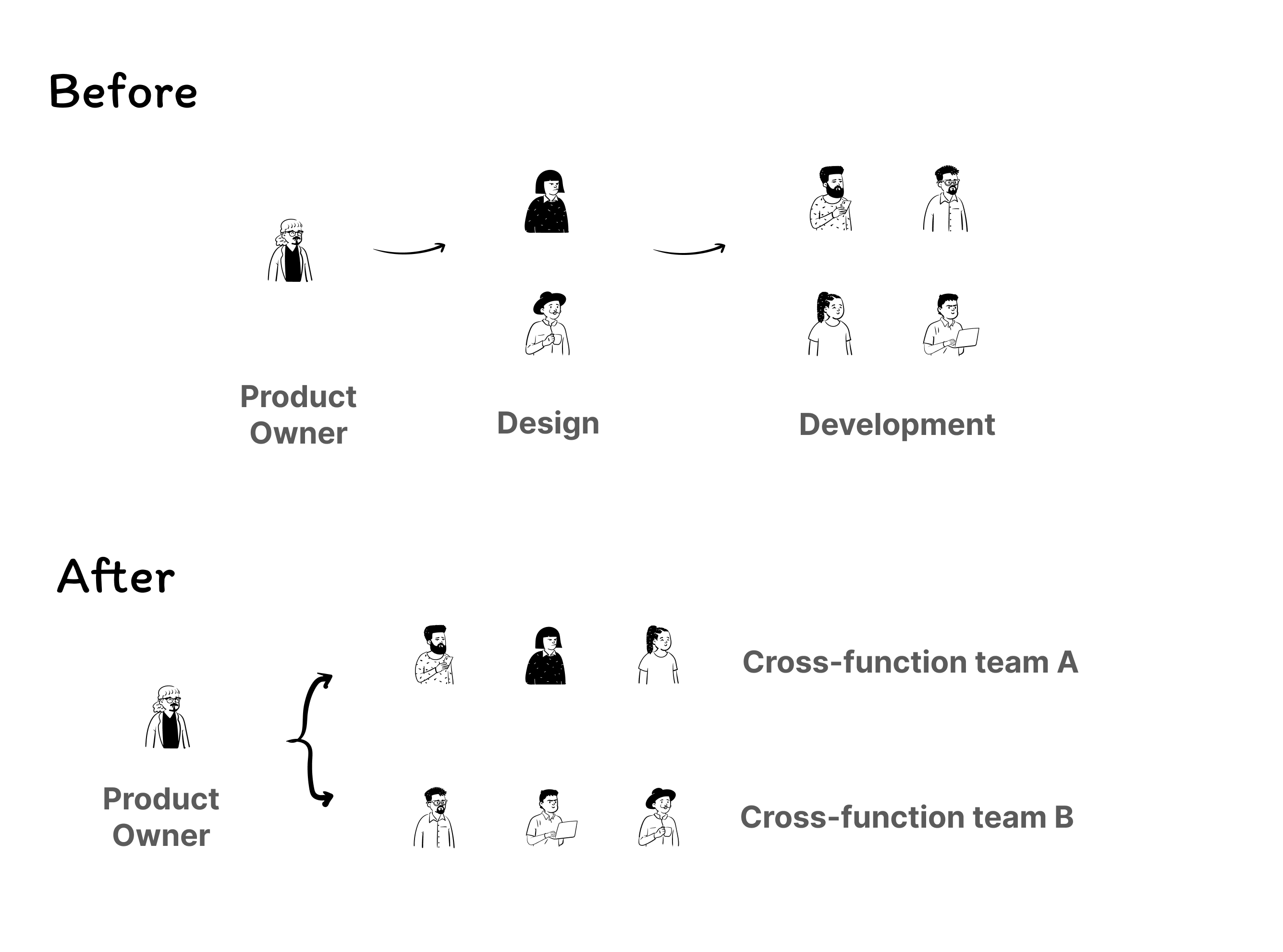 circulate feedbacks and fixes in smaller group
Delivery: Balancing Technical Complexity and Client Needs
As the joint frontend lead, part of my responsibility is to ensure the project is delivered on time and within budget. Throughout the project, I worked very closely with the business stakeholders and designers to understand their needs and provide the best solution. The top marketing execs of DNRG were very hands-on with the project. They had a lot of ideas and wanted to see them implemented, yet some of the requirements are either not feasible or would take too much time to implement.
As a result, there are times where we need to push back on the client’s request to ensure the project’s timeline and budget are met.
For instance, about 2 months util go live date, the client requested that we implement a dark mode for about 1/3 of the pages (mostly articles). This request came in at a time when we were already in the final phase of the project, almost 100% of the UI Components are already signed off by design and QA.
So here was my response to that client request:
Cut to the chase
Personally I think dark mode is a great idea to provide a more accessible user experience, but I’m afraid we won’t be able to implement it in time for the go-live.
Rationalize, but without technical jargon
Yes, our frontend architecture is highly flexible and allow us to specify global themes for the entire site, nonetheless we still have to consider the other works that could occured, such as accessibility defects, UI redesigns, style guide updates etc. These unknown factor could really jepardize the project timeline.
Provide an alternative solution
That said, we can still provide an alternate solution: A theme switcher widget that allows users to toggle an experimental high contrast mode. This way we can still provide a more accessible experience, while also controlling our workloads. And we can always revisit the dark mode implementation in the next phase of the project.
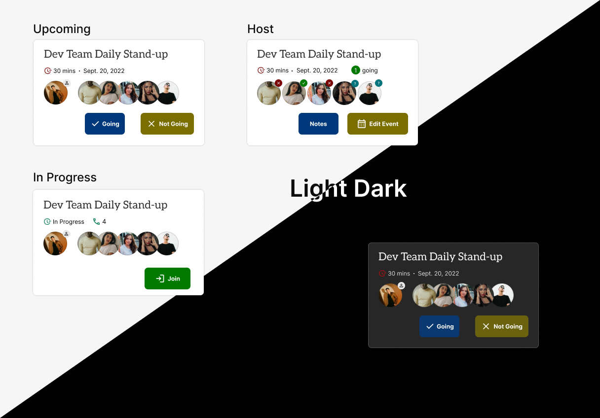 Example of dark mode on a component
Outcome
The project was delivered on time and within budget. Engagement and Sales on the website increased by 10.5% in the first month after the launch. The client stakholders were very happy with the result, since this is the smoothest launch they’ve ever had for this brand. The new website is now live and has been well received by the users.
DNRG was one of the smoothest launches in the brand’s history. It was well regarded by all levels at DNRG to have been a huge success. His portion of the site was completed well ahead of the go-live which helped to reduce the last-minute pressure and make everything as smooth as it needed to be. Huge shoutout for leading the Front End team to success here. Jason’s role cannot be understated.
Lesson Learned
- Frequent Communication/Check-Ins: We encounter several instance when request for changes are conflicting with each other, and then blocked with individual team members withou escalating.
- Follow Best Practice: Hard-coded variables and inefficient solution had caused some troubles on user experience. We need to create a documentation of React component best practices.
- Automate Testing: Our testers had to go through each of 1,000 pages to find accessibility issues and UI inconsistencies. Although we do have Selenium setup for key engagement flows. Many minor pages were omited.